
Colors of the Year 2022: Here's How to Use Them
It's that time again when paint brands and color institutes announce their picks for the upcoming Color of the Year. It's not just a trend forecast. The Color of the Year inspires designs around us, especially interior design. And that's great for us decor enthusiasts, because we get fresh color ideas for our homes as well!
Here are the Colors of the Year for 2022. Spoiler alert: It's a sea of green shades and one unique purple! We also show you tips and examples on how to use them in your home. Read on and get inspired!
1. Pantone Color of the Year 2022: Very Peri

Pantone is arguably the biggest name in color science, and for 2022, they have chosen a purplish-periwinkle hue called "Very Peri" as Color of the Year. According to the institute, this color has "the quality of the blues, yet... displays a spritely, joyous attitude."
How to Use Pantone's "Very Peri"
Cozify your bedroom.
This color's peaceful yet happy vibe is something you would want in your bedroom. Very Peri might make an interesting wall color, but it's best as an accent shade on top of a neutral color scheme, like the beddings in this example:
Feature in a lovely artwork.
Very Peri is a beautiful hue for art pieces, reminiscent of lilacs and violets. It's also strangely mood-boosting. Look for a wall decor piece featuring this color, and hang it in your entry or dining room for a soft, welcoming atmosphere:

Wall art pictured above: "The Best Things - People, Places, Memories" Premium Canvas
2. Behr Color of the Year 2022: Breezeway
Back in August, paint brand Behr was one of the first to announce their Color of the Year 2022, and it's an ultra-light silvery green called "Breezeway". The company says it is "inspired by naturally stunning sea glass found on the shore of salty beaches" and that it "evokes feelings of coolness and peace."
How to Use Behr's "Breezeway"
Create a subtle contrast.
This shade is a really good wall color if you like a calm, minty green for your space. But to keep it from looking boring, use a second color to create a subtle contrast on your trim or paneling. The example below is from our customer Angelia M., using a light minty paint color alongside white wainscoting and molding. So soft and beautiful!

Wall art pictured above: Personalized "This Is Us" With Names On Background Premium Canvas
Use as a pastel to your neutrals.
If your home has a neutral color scheme and you would like to add color to it without taking away its softness, Breezeway is the perfect addition. Use it as an accent paint, or translate this hue onto other decor elements like your throw pillows and tabletop decor.

Wall art pictured above: "Because Someone We Love Is In Heaven" Premium Canvas
3. Benjamin Moore Color of the Year 2022: October Mist
Benjamin Moore's Color of the Year 2022, called "October Mist," is part silver-gray, part sage-green, and overall a cool, clean neutral. According to the paints giant, this shade "quietly anchors a space, while encouraging individual expression through color."
How to Use Benjamin Moore's "October Mist"
Enliven with art.

As the paint company says, "October Mist" is a quiet canvas. If you are using this wall color in a social space like your dining room, living room, or entry, make it memorable with wall art. If you're not sure what decor colors go with this shade, pick artworks that complement the wall's green-gray hue, like the example above.
Wall art pictured above: Personalized "Family... Love" With Names On Background Premium Canvas
Make a calm private nook.
On the other hand, "October Mist" is a paint color that makes for a serene, laidback ambiance -- perfect for your reading nook, tea corner, or breakfast nook. The best decor for a space like this? Indoor plants that add vitality without disrupting the peace. Plus, the varying shades of green are instantly complementary!
4. Dulux Color of the Year 2022: Olive Sprig
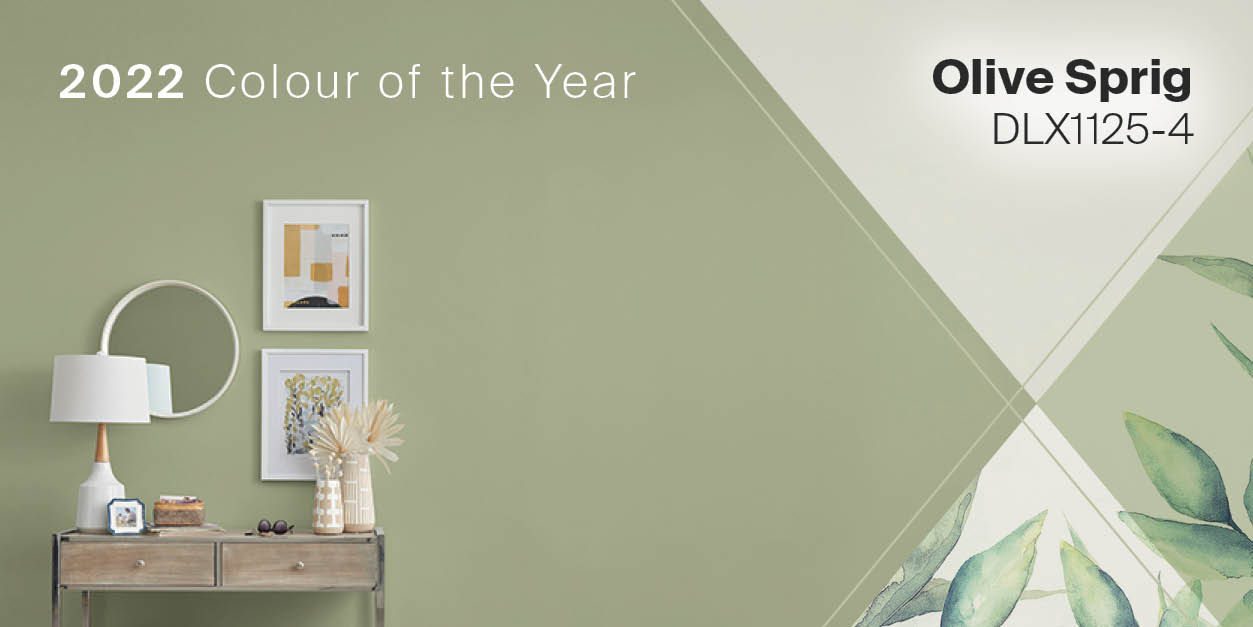
Here's another soft green to reign in 2022! Paint brand Dulux says "Olive Sprig" is "a relaxed but enticing green that emulates the feeling of soothing aloe vera or a fragrant plant." Unlike the previous two green colors on this list, this one's more organic than silvery, so it's a little brighter and softer.
How to Use Dulux's "Olive Sprig"
Display with natural materials.

This shade is so botanical that natural colors like wood and stone easily complement it. In fact, even if you're not repainting your wall for now, you can bring home this color with herby greens like sage and eucalyptus, arranged in graceful displays on your wood table. So charmingly rustic!
Wall art pictured above: Personalized "Family Tree - Whole Lot Of Love" Premium Canvas
Try it in small doses.

If you love this olive green but aren't quite sure if it would work on your walls, try it in artworks as a sort of 'introduction' into your color scheme. Complement that with similar colors on your throw pillows and tabletop decor. One key to this is to choose soft, muted shades instead of vibrant ones.
Wall art pictured above: "May The Road Rise Up To Meet You" Irish Blessing Premium Canvas
5. Sherwin-Williams Color of the Year 2022: Evergreen Fog

Sherwin-Williams may have picked a predominantly gray color for 2022, but once again, it's a shade that's tinged with the most subtle touch of green. The paint brand describes "Evergreen Fog" as a "soothing, subtle" hue that can "freshen up any space."
How to Use Sherwin-Williams's "Evergreen Fog"
Apply on furniture.
If you feel like this color is too shady or dramatic for your wall, it can work beautifully as an accent color instead. How about using it on your shelves, chairs, or countertops? We can even see this as a unique door color or window trim.
Contrast it against white and wood.

The contrast of cool gray and bright white is a classic. But you can make it more stylish: add a touch of light wood in there to soften that crisp color combo. Maybe a rattan chair or a reclaimed wood headboard (like our example above)? This layered look has been big for a few seasons now, and will likely be a mainstay for many homes in the future.
Wall art pictured above: Personalized "We Decided On Forever" Premium Panoramic Canvas
So what do you think of these colors for 2022? With so much green in the selection, we think forecasters are feeling really at home with comforting, familiar colors.
If you liked the wall art pieces you see here, or if you want to jazz up your walls this New Year, browse GearDen.com for more customer-starred decor!