Going Minimalist? Here's How to (Still) Decorate Your Walls
Share
A minimalist home doesn't have to be empty or boring! You can still hang art and other wall decor even when you decide to streamline. In fact, some of the most enviable homes we've seen are minimalist ones, but they are still tasteful and homey, not least because of the thoughtful decor they've picked for their space.
Minimalism in interiors means getting rid of clutter and paring down to the essentials -- and when done right, it can be both aesthetically and practically beautiful. Take a look at these decor tips and lovely examples on how to decorate the walls in your minimalist house.
1. Choose a restrained color scheme.
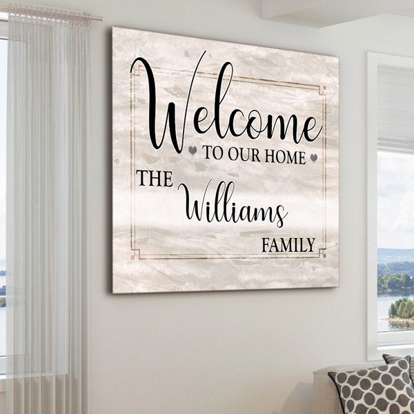
Wall art pictured above: Personalized "Welcome To Our Home" Square Canvas
Restraint in this case applies to two things: the number of colors you use, and the actual shades that you pick. It's best to keep the number of colors down to a minimum -- two colors are actually enough to create a beautiful interior space. When choosing wall decor, make sure it fits within this minimal color palette.
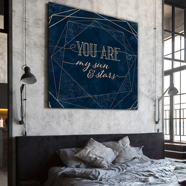
As for your actual color choices, experts agree that a neutral palette is best for a clean, minimal look. That means whites, blacks, grays, beige, and wood tones. But if this sounds a little too bare for you, don't worry! Most other colors can actually suit a minimal home -- if you choose the right shades. If you want blues, greens, or reds in your interiors, pick them in darker, muted shades (like in the photo below) or in light-as-air pastels.
Another loophole you can employ: Keep your walls and most of your interiors in neutral colors, then accent with one or two elements in the bold color of your choice, like here:
Wall art pictured above: "You Are My Sun And Stars" Premium Canvas
2. Mute your patterns.
You've probably noticed how minimalist homes look so peaceful and put-together. Their secret is that they have so little visual clutter! Clean lines are important in minimalistic decor, so try to tone down on patterns and shapes.
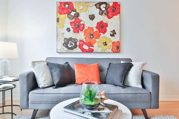
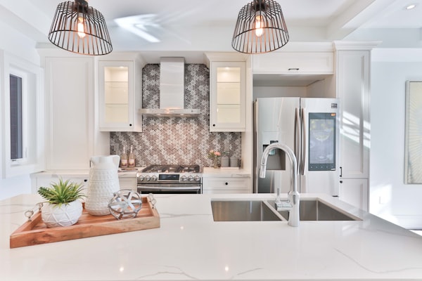
If there's a pretty pattern that you'd really like to show off, you can commit to displaying it as your one main focal point in the room, like in the photo above. Or consider getting the pattern in a subdued color that fits unobstructively with the rest of the room, like the backsplash design in this kitchen:
3. Go big.
Wall art pictured above: "Soulmates" Premium Panoramic Canvas
Want to make an impact with wall art without any fuss? Instead of putting up a gallery wall or a collection in a room, go for one large-scale piece instead. With it, you minimize the visual lines on the wall, and you draw the eye to just one place in the room (as opposed to spreading the viewer's attention all over a gallery wall). Yet you're not short-changed on impact -- big wall art makes a big impression!
Just take a look at the bedroom wall decor above, which comes in a cool gray color but is still so eye-catching with its oversized dimensions. (Learn more about panoramic wall art here.)
Here's another example: a simple yet large wall sign that serves as a single elegant spotlight on the family name:
Wall art pictured above: Personalized Family Name Color Choice Canvas
4. Align art with surrounding shapes.
As mentioned above, clean lines are vital in attaining minimalist home interiors. The sides of your wall art, the edges of your furniture, the outlines of your ornaments -- all these are lines that contribute to the visual of a room. You want to keep these lines down to a small number (the fewer shapes the eyes see, the better), and arrange them in a way that they parallel -- instead of contradict -- each other.
So when hanging art in a minimalist homes, be mindful of its dimensions in relation to surrounding objects. The cleanest-looking placement is one where the decor shape and dimensions reflect the furniture immediately next to it. Notice how the wall art above goes seamlessly well with the mirror right below it.
Wall art pictured above: "This Is Us" Premium Panoramic Canvas
5. Keep it neat, tidy, and spacious.
:max_bytes(150000):strip_icc():format(webp)/cdn.cliqueinc.com__cache__posts__195935__how-to-decorate-like-a-minimalist-1814000-1466621164.700x0c-76f47a6443db4ee09a3149fa66f0b111.jpg)
We can't emphasize this enough: the two most important elements in a minimalist homes are neatness and space. But this doesn't mean your house needs to be humongous with high-ceilings and a generous square footage! It simply means that your decor elements have to be tidied up and not packed close to each other, giving the viewer's eye plenty of room to 'breathe.'
Needless to say, your walls shouldn't be weighed down with extraneous elements. Keep them clear of messy hooks and hangers, clashing textures, and cramped shelving. Even surrounding furniture can change the look of a wall, so make sure the shape of that couch doesn't look frumpy, the surface of that sideboard is clear, and that kitchen counter is devoid of odds and ends.
And what do you do with those extraneous things you have to remove but just can't throw out yet? Interior decor expert Sacha Strebe suggests you invest in stylish storage in which you can stash away all your not-so-minimalist stuff . ;)
Try these minimalist decorating tips and see how easily you can achieve a clean, sophisticated wall display. We'd love to hear about your results in the comments! And we'd appreciate if you leave your own tips, too.
For more of the wall decor featured here, browse our canvas print collections at GearDen.com!


