Your Cart is Empty
SPECIAL OFFER - ALL CANVAS ORDERED TODAY ARE UPGRADED FREE TO 1.25" THICKNESS!!
SPECIAL OFFER - ALL CANVAS ORDERED TODAY ARE UPGRADED FREE TO 1.25" THICKNESS!!
0
Your Cart is Empty
SPECIAL OFFER - ALL CANVAS ORDERED TODAY ARE UPGRADED FREE TO 1.25" THICKNESS!!
SPECIAL OFFER - ALL CANVAS ORDERED TODAY ARE UPGRADED FREE TO 1.25" THICKNESS!!
Your Cart is Empty
January 08, 2024 8 min read

New year, new interiors! Our favorite color companies and paint brands have revealed their Colors of the Year 2024, and it's a sea of blues with some diverging colors sprinkled in. Let these beautiful shades spark your redecorating spirit or guide you on your repainting project this spring. Here, we'll get you started with some fab ideas to decorate your home with Colors of the Year 2024.

A cheery pastel peach has been crowned Color of the Year 2024 by leading color institute Pantone. Embodying comfort, kindness, and optimism, this hue is perfect for brightening up dull spaces. And if you feel that Peach Fuzz is too 'young' and 'juvenile' of a color, wait till you see our grownup tips to decorate below.
Image above from Pantone
It may be a non-traditional color combo, but velvety jewel tones pair so well with peach walls. This balances the youthfulness of the pinkish wall with the sophistication of deep gem colors. To capture this look, try a wall-adjacent piece of feature furniture like an emerald-green sofa or a navy-blue sideboard.
Wall art pictured above: Personalized Family Names On Tree Premium Canvas
Spaces like the kitchen, bathroom, and office tend to be all function, no cheer. Liven it up with a peach color on your walls! If you like this idea but don't want peach everything, try painting just one wall as a focal point, or simply fill the room with peach-colored decor.
Wall art pictured above: "Wash Your Hands, Ya Filthy Animal" Premium Canvas
Your bedroom should be your personal sanctuary, so fill it with pleasant colors that make you feel warm and fuzzy. Above, our customer Krystel S. has created a peachy keen sleeping area using a pastel wall color with peach-hued beddings. It's just the right balance of feminine and elegant.
Wall art pictured above: "Love Is Patient, Love Is Kind" Premium Canvas
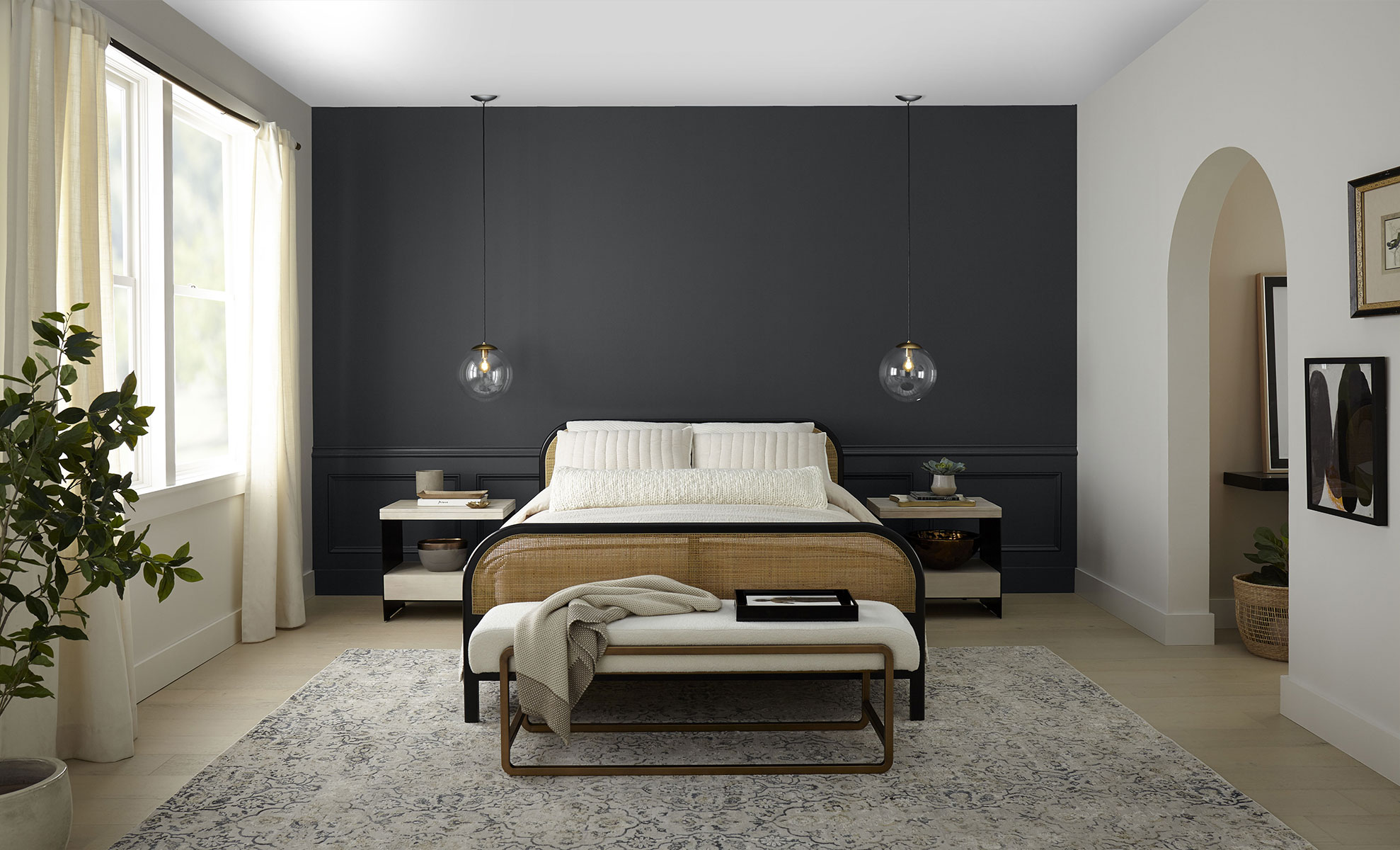
We don't always think of black as a dominant neutral for our homes, but Behr's Cracked Pepper is a soft, luxurious black that works so well for this. Even when applied on full walls, this color looks plush and cozy -- and it goes with anything!
Image above from Behr
This solid hue commands attention without looking garish, so it's the perfect stage for some dramatic wall styling. Above, the black wall color just pulls your eyes towards the board-and-batten paneling and rustic wall art. Try a similar trick on just one accent wall of your room and see the huge difference.
Wall art pictured above: "This Is Us - Our Life, Our Story, Our Home" Premium Panoramic Canvas
Whether you want some sleek, modern kitchen cabinets, or a moody bookshelf with dark academia vibes, Black Pepper is the paint shade for that makeover. Consider a piece of furniture you've long wanted to repaint, and imagine how this versatile black color can elevate it into a sophisticated feature piece.
Metal art pictured above: Personalized "Tree Of Life" Custom Metal Sign
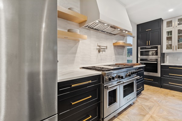
Alongside white, the perfect complementary shades to Black Pepper are bright wood tones and warm metallics. For example, if you're using this black paint on your cabinets, match it with gold or brass pull handles for a gorgeous polished look. If you're doing a full accent wall in black, surround it with furniture in oak or maple finishes.

This gorgeous indigo shade is a great choice if you want a pop of blue or violet that doesn't look too 'Crayola bright.' On the contrary, this hue feels thoroughly regal when applied on feature walls, painted on cabinets, or used on upholstery.
Image above from Benjamin Moore
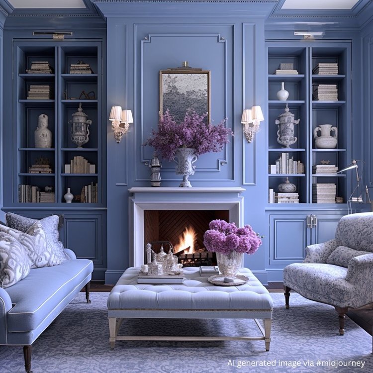
Your fireplace wall or accent wall can look so sumptuous when you add some picture-frame molding and coat it all in this velvety blue. Just look at the example above from JRL Interiors! This living room is reminiscent of those French royal parlours in the era of Marie Antoinette.
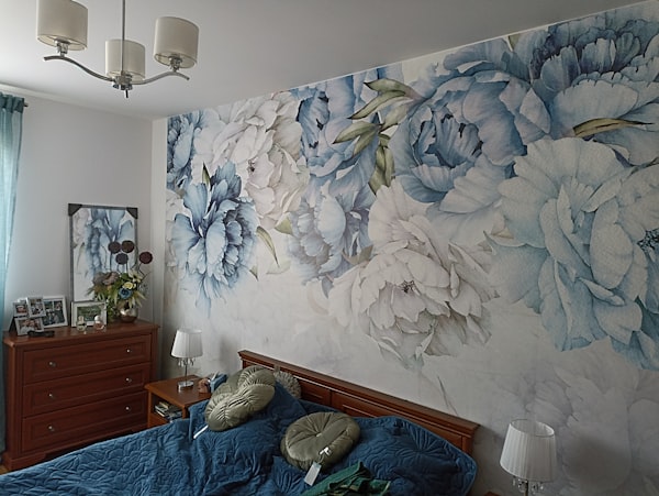
The stately feel of Blue Nova allows you to play freely with bold patterns while still keeping the look sophisticated. This makes it perfect for murals and wallpapers! If directly painting a mural isn't feasible, you can opt for a nice wallpaper in a similar shade (like above). P.S. Contact paper is a cheaper alternative, and it comes in lovely prints, too!
Reddish wood stains like cherry and mahogany play off nicely against indigo blue. These colors bring out each other's brilliance without upstaging the other. This means you can simply repaint your wall a nice matte indigo then arrange your wood furniture against this smooth backdrop.
Wall art pictured above: Personalized Family Name Color Choice Premium Canvas

Dutch Boy is one of the few companies that didn't pick a blue shade for their 2024 Color of the Year. What they did pick was a unique metal-like deep green aptly called Ironside. It's an olive-green made several shades darker with hints of gunmetal gray, making it a distinctive solid color that's hard to ignore.
Image above from Dutch Boy
If "dark and dramatic" is your interior style, Ironside is right up your alley. Borrow this moody green for your space to evoke the cool mysteriousness of a winter forest, a medieval castle, or a dark academia hall. Go all the way by pairing this shade with a cool gray and some hardwood furniture.
Metal art pictured above: Personalized Name Monogram Custom Metal Sign
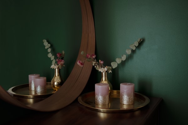
Warm metallic finishes like gold, copper, and brass are a go-to for perking up moody wall colors, making the space feel opulent instead of oppressive. A deep-green wall, for example, would look palatial when fitted with gold or brass sconces. Or you can simply accessorize with metallic vases, candleholders, figurines, or the like.
If you like a muted green shade like Ironside but want your space to be bright and modern, try complementing your walls with yellow or orange decor. Also, a gallery wall would add a sense of movement and casualness to the space, breaking up any monotony that comes with somber wall paints.
Central wall art pictured above: Personalized "Love - Names On Heart" Premium Canvas

Sherwin-Williams chose an oh-so-sweet shade of blue as its 2024 Color of the Year. Aptly named Upward, this whisper-light sky blue feels as breezy as an early summer morning -- you could almost feel the fresh air! We can already see this color gracing homes for Easter next year.
Image above from Sherwin-Williams
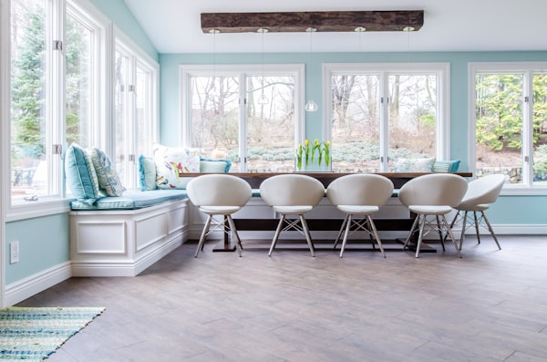
The Upward color evokes a sunny sky so much that it can instantly turn a room into a nice morning-like space. This makes it perfect for a breakfast nook, coffee bar, or reading corner. Or you can take it one step further by painting your entire dining room this color. Imagine coming down to this scene for breakfast!
Even a builder-grade bathroom can turn into a beautifully soothing space with this nice blue color. Add white trim or wainscoting, top with some pretty wall art and potted plants, and voila -- a personal oasis. The best part is, soft blue paint is light enough to make a small room like this feel airy.
Wall art pictured above: "Save Water - Shower Together" Premium Canvas
Pastel blue is a timeless color choice for a nursery -- it's soothing, easy on the eyes, and easy to decorate. If you love this shade but want to make it more attractive, try a two-tone wall like above. Pair it with a darker hue in the same color family, and accent with child-safe wall hangings.
Learn the must-know nursery decorating tips -- click here!
Wall art pictured above: Personalized "Now We Have Everything" Premium Canvas

Rarely do we see beige featured as a Color of the Year, but PPG/Dulux did just that with Limitless. This yellow-based neutral feels warmer than stark white but is just as versatile and unobtrusive -- making it a foolproof hue for any interior or exterior painting.
Image above from PPG
Neutrals like Limitless are the perfect background for colorful wall decor. If you're planning a wall gallery of pictures, this paint color is a no-brainer! Alternatively, you can hang one big artwork you absolutely love, drawing everyone's attention to it.
Wall art pictured above: Personalized "They Are The Beat Of My Heart" Premium Canvas
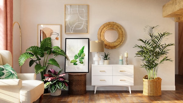
When you have beige as your primary color, you'll want to add some texture and layers to the room to elevate its visual appeal. The best way to do this is with big, lush plants! Bring in a few potted indoor plants with varying sizes and foliage shapes. Instant facelift!
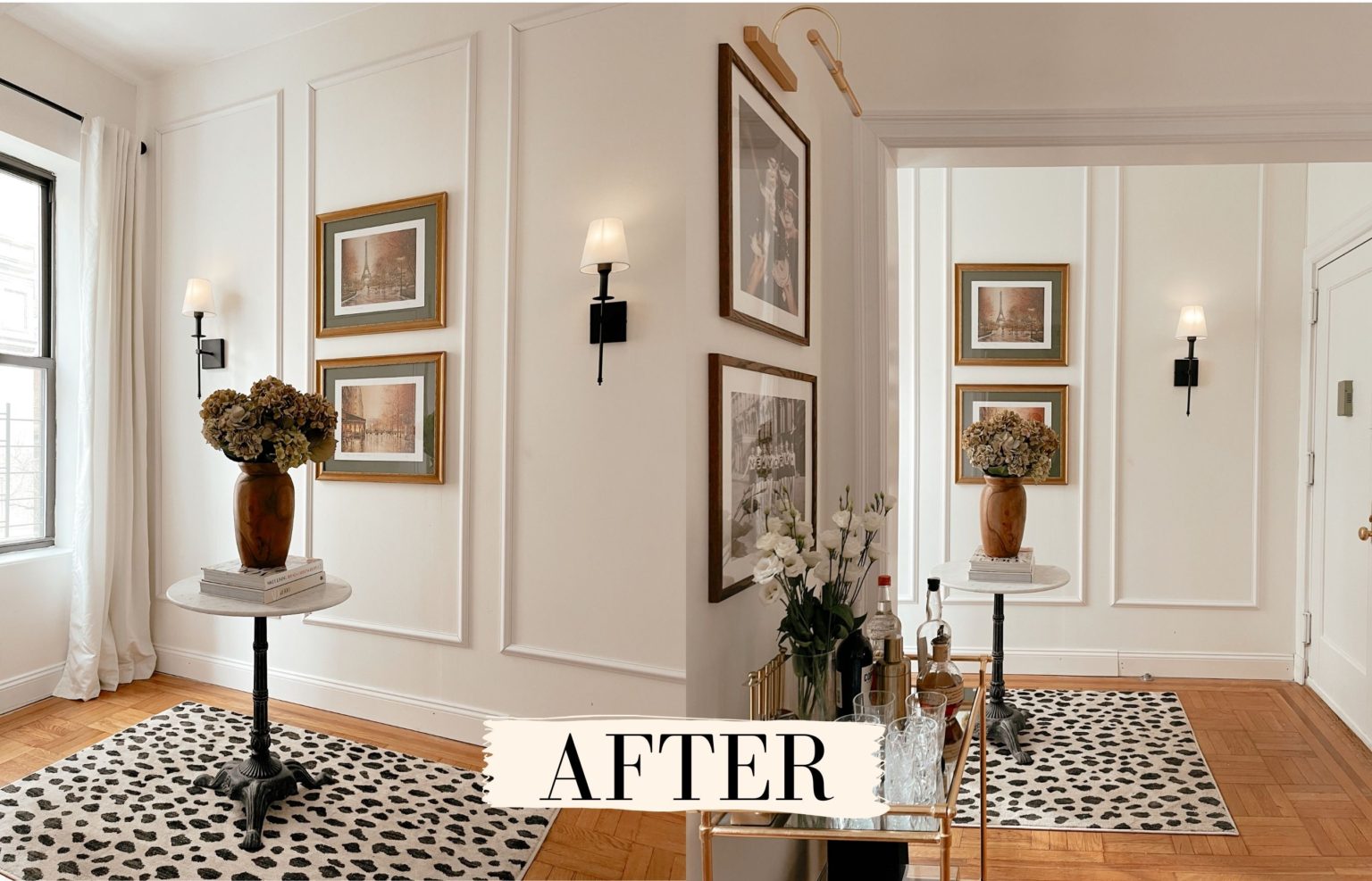
Speaking of texture, one way to glam up a neutral wall is with decorative trim. Not all homes are blessed with this feature, but don't worry -- there are easy ways to 'install' picture-frame molding without much carpentry. Our favorite example is the stylish hallway above by The Page Edit. Believe it or not, those are stick-on trims!
We have lots of other ideas to decorate a beige wall without repainting. Read our blog post here!
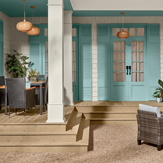
This lovely color is a meeting of seafoam green and robin's egg blue -- just the shade you want for a calm yet cheery color scheme. While Renew Blue can make a great primary wall color, we think it's too pretty to fall into the background. Let it take centerstage as an accent color, and watch the compliments come rolling in.
Image above from Valspar
"Coastal grandmother" is a cushier, more grown-up version of the beach cottage interior style. Imagine Nana's skirted sofas and pretty florals, in a space painted in baby blues and sandy neutrals. So fresh!
Click here to learn more about grandma-inspired decor trends.
Wall art pictured above: Personalized "Food, Family, Love" Premium Canvas
The bright serenity of Renew Blue is such a mood-lifter, it deserves to get a spotlight in your decor. How about a wall art piece in this pretty color? Above, we use this blue-green shade as an accent color on a romantic wall print. It works wonderfully with the rustic shabby-chic design.
Wall art pictured above: Personalized Couple's "Connected Heart" Premium Canvas
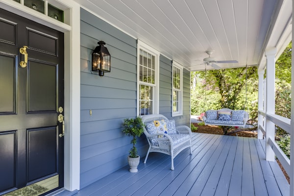
Taking inspiration from the "haint blue" porch ceilings of the South, a sweet sky-blue shade can uplift the façade of your home. Use it as the main color or as an accent color on your door, shutters, and trim. It goes well with many complementary hues, but one of the most vibrant pairings is this soft blue with crisp white.
So what do you think of these 2024 Colors of the Year? We love them and can't wait to redecorate for next season! Which ones would you use? Tell us in a comment!
If you liked the canvas artworks and metal signs above, you'll love our collections at GearDen.com. We have tons of fabulous wall art with personalized options. Browse now!
Comments will be approved before showing up.

December 28, 2024 7 min read

October 01, 2024 5 min read
We all love traditional autumn decor, but sometimes, there's a yearning for something fresh and extraordinary. Thankfully, 2024 fall decor trends bridge the gap between the classic and the new. Take a look, be inspired, and wow your guests!

July 25, 2024 4 min read
Moody interiors can be so lovely for the home! The only thing is, if you're not careful, a dark space can feel gloomy, not stylishly moody. So how do you create a moody ambiance without making the room feel depressing? Pull it off with our decor tips!
Get a sneak peek on upcoming promos and get 10% off your first order!