Your Cart is Empty
SPECIAL OFFER - ALL CANVAS ORDERED TODAY ARE UPGRADED FREE TO 1.25" THICKNESS!!
SPECIAL OFFER - ALL CANVAS ORDERED TODAY ARE UPGRADED FREE TO 1.25" THICKNESS!!
SPECIAL OFFER - ALL CANVAS ORDERED TODAY ARE UPGRADED FREE TO 1.25" THICKNESS!!
Your Cart is Empty
January 28, 2020 5 min read

That triangular space under the stairs. The skinny bit of wall by the entry door. A protruding wall or a recessed nook. Even though these awkward walls and corners are so common, we are still often stumped on how to beautify them!
That's why here at Gear Den, we like to collect ideas on decorating oddly-shaped spaces in the home, be it with wall art, furniture, or even plants! Here are ten of our favorite tips on how to decorate a tricky wall in your house. Try one or two of these yourself.
If your home has a staircase, you're all too familiar with the dilemma of that irregular wall under the steps. It's too large to ignore, but also too weirdly-shaped to hold any regular wall decor. Fear not: you can turn this space into a lovely and useful spot. Just arrange a piece of furniture or two against this wall!
Many homes opt to place a console table, sideboard, or bench by the stairs (like image above), but one of our favorite decorating tips right now is to style a chair and side table by the staircase for an instantly classy foyer! Just look at the vignette below, found via Terra Vista Interior Design:

Regular-sized wall art won't look at home on an irregular-shaped wall, so go for artwork with unusual dimensions! Ever heard of vertical panoramas? They're extra-tall pieces that look great on tall, narrow walls. The family canvas print above is an example, available on Gear Den, and it looks just right on this tall entry staircase.
If your under-the-stairs space is a little limited but still looks too empty, try this decor trick: hang an artwork there and place a lovely plant under it. It's a no-fuss combo, but one that completely transforms the bare corner into a vibrant vignette. We copped this tip from some savvy Gear Den customers whose real-life homes are so thoughtfully decorated! Ms. Linda D, for example, shows us her use of our personalized "Home" vertical wall sign to add life to her stairs.
Most hallways are tricky to decorate because they don't have ample floor space for admiring art and photos. Save your family portraits for a more prominent wall in a brighter room. For a narrow hall, opt instead for an eye-catching panoramic wall art that 'accompanies' the path. The rustic Home sign above, for example, is visible (and beautiful) enough for passersby to appreciate as they move to the next room.
Bonus tip: Want to brighten your hallway even more? Consider adding some light-colored molding or baseboard to it! See also our other tips for brightening a low-light room.

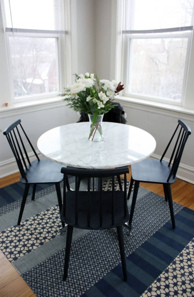
Some homes have odd little corners in them that don't quite fit with the rest of the room. Maybe it's a space between built-ins (like between the fireplace and the wall), or maybe it's a quirk in the house's floor plan itself. If you have a small corner that you don't know what to do with, find a table that would fit just right in there, then style as you like. It can be a small desk that you push up against the wall, turning it into a cozy, tiny work space. Or, as shown above by Apartment Therapy, you can even create a lovely little dining space in there -- just use a small round table, as it can seat more bodies in this corner nook. Add a pretty rug and this unwieldy corner becomes an interior design feature!
There are also those walls that are barely more than a skinny strip of wood but are still so visible in your interiors. Usually, you find them by doorways, between rooms, and between windows. Well, our stylish home decor customers have once again wowed with their clever solution in this area. Check out what Trudy T. did to that extra wall in her dining room: she thoughtfully arranged a vertical artwork, a side table, and some ornaments in there, creating a decor vignette that even Instagram would love. The wall went from weird to wonderful!

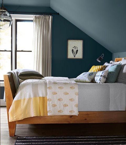
Trying to decorate an attic bedroom or an A-frame house? For the most elegant and visually pleasing result, leave those slanting walls alone. Keep them color-coordinated and clean, as their irregular orientation can easily look cluttered when laden with ornaments. Focus your decorating energy instead on the lower half of the room, such as the bed, seating, and flooring. We love the bedroom above on Country Living, with its brightly dressed bed and unique rug -- the sloping walls don't distract at all!
Some homes come with a built-in recess or niche in one wall. While this architectural detail isn't very common and may present a challenge when decorating, it can actually become a stunning feature when treated right!
Use your recessed wall as a unique gallery display of art and photographs you love. Select a few pieces that are coordinated but still have an interesting variety -- for example, same color palette but different sizes. Lean them against the wall recess, playing with the variety and layering. Complete the look with a '3D' object like a vase or figurine. So chic!
A more common feature in American homes is, unfortunately, a bit of wall that sticks out from the rest -- such as that feature wall that houses your fireplace. It may not be as straightforward as a simple wall, but it's not hard to decorate.
Some homeowners try to find ways to blend the protruding wall back into its background, but it's better to play it up instead! Use it as a focal point in the room by mounting your favorite wall art on it -- the bigger, the better. Think of this wall as the main display in your very own 'museum.' See our example above with the personalized "Family Is Everything" print, or the one below with the bestselling family names custom print, or the quirkier display further below with the personalized "Love & Laughter" sign:
A home with an open floor plan may have more freedom and fewer walls, but it has its share of decorating challenges, too. For instance, how do you delineate the dining area from the rest of the house? You don't want your entire home to feel like one giant mess hall!
One genius solution is by deliberately styling the dining decor in a way that looks overall sophisticated even when it's not mealtime. This means maybe steering clear of those fruit-basket artworks and opting for more versatile pieces instead. In the example above, the dining table easily becomes a stylish decor element thanks to its few but carefully-selected table toppers. Then, the custom family monogram artwork is hung over it, completing the dining set as a vignette of its own without overwhelming the house with food imagery.
Which of these corner decor tips will you use at home? Or do you have a decorating idea of your own based on your home interiors? We'd love to hear from you in the comments! In the meantime, shop for your next favorite wall art at GearDen.com!
Comments will be approved before showing up.

December 28, 2024 7 min read

October 01, 2024 5 min read
We all love traditional autumn decor, but sometimes, there's a yearning for something fresh and extraordinary. Thankfully, 2024 fall decor trends bridge the gap between the classic and the new. Take a look, be inspired, and wow your guests!

July 25, 2024 4 min read
Moody interiors can be so lovely for the home! The only thing is, if you're not careful, a dark space can feel gloomy, not stylishly moody. So how do you create a moody ambiance without making the room feel depressing? Pull it off with our decor tips!
Get a sneak peek on upcoming promos and get 10% off your first order!