
For a Relaxing Home, Try These Calming Color Palettes
It's a dream to come home every day and instantly feel relaxed and comfortable (as you should)! Certain homes have this serene quality -- warm but not blindingly bright, clean but not dull or clinical. A true oasis of calmness.
One of the most important design elements that create this ambiance is color, or more specifically, the color scheme. If you're planning to redesign your interiors to make your home feel calmer, read this guide on which color combinations are best to use.
1. White + warm wood
White is the simplest base color that goes with anything, but at times, it can be a little too stark to the eyes. Soften this bright color with touches of warm wood tones. Wood like cherry, maple, or white oak all have that yellowish or orange-ish undertone that evokes a soft warmth.

Wall art pictured above: "But First, Coffee" Premium Canvas

Wall art pictured above: Personalized "Family Is Everything" Names In Heart Premium Canvas
2. Gray on gray
Pairing two shades from the same color family is a foolproof way to make your palette look neat and put-together. Gray is a fantastic choice for this because this color family is a solid yet soothing neutral. You can either start with a dark gray as your dominant color then layer soft light grays over it, or opt for a lighter gray base color with darker gray accents all over.


Blanket pictured above: Personalized "We Should Probably Cuddle" Premium Fleece Blanket
3. Cream + black
The color cream is like a very light, pinkish yellow, or a warm-toned white. It has all the versatility of a neutral hue, but unlike crisp whites, cream looks soft and rich, almost buttery. This quality makes it a comforting homey color. To balance it and prevent the space from looking washed out, accentuate certain lines and shapes with a more solid neutral like black or charcoal.
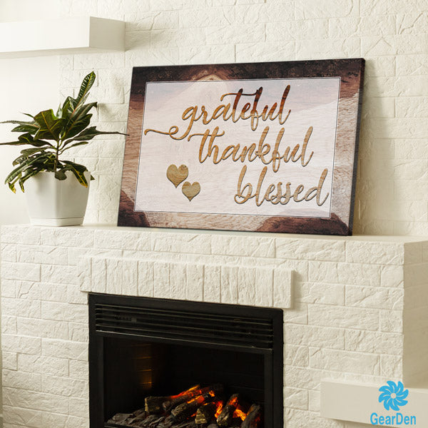
Wall art pictured above: "Grateful, Thankful, Blessed" Premium Canvas
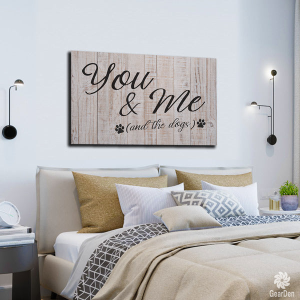
Wall art pictured above: "You & Me (And The Dogs)" Premium Canvas
4. Concrete gray + butter yellow
Concrete as a calming color? Absolutely. There's something soothing about the cool, clean vibe of this material. According to color psychology experts, gray concrete also evokes minimalism and simplicity. Of course, if you want more cheer in your concrete-walled space, you can add pops of color. Most bright hues go well with concrete, but its classic partner is the sunny butter yellow.

Wall art pictured above: "Difficult Roads Lead To Beautiful Destinations" Premium Rustic Canvas
5. Navy blue + blush pink
Blue is well-known as a peaceful color family, and among all the blues, navy is a standout shade that creates a sense of quiet opulence. It's a regal hue that makes the room feel elegant and cushy at the same time. This color is gorgeous on its own, but if you want to brighten a navy blue room without taking away its serenity, a whisper-light blush pink is the perfect match for it.

Wall art pictured above: "Enjoy Today" Premium Canvas
6. White + sand + powder blue
Here's the classic "coastal interiors" color trio! Sandy hues and pastel blues perfectly encapsulate the atmosphere of an oceanside cottage -- like you're living by the beach with sunny skies and the sound of gentle waves. It's enough to soothe anyone to sleep!

Wall art pictured above: "Be Our Guest" Premium Canvas
7. Greige + light wood
Greige (the combination of gray and beige) may be an unobtrusive neutral that people never notice, but when paired with wood accents, the overall look can be beautifully serene. Punctuate your greige walls with warm wood elements like a weathered wood mantle or a woven rattan container.
Need affordable wood decor? You can get realistic wood-like wall art pieces from Gear Den! See these examples:

Wall art pictured above: "Serenity Prayer" Premium Rustic Canvas

Wall art pictured above: Personalized "This Is Us - Grateful, Thankful, Blessed" Premium Canvas

Wall art pictured above: Personalized "Our Story - First We Had Each Other" Premium Canvas
Do you agree that these color schemes are calming and beautiful? What color palette do you like for your home? Leave a comment!
For more of the wall art and home decor featured here, browse GearDen.com! Our canvas wall prints and interior decor items are highly rated by customers like you. Happy decorating!
Related blog posts: